SELECTIVE FOCUS
A Director can use SELECTIVE FOCUS to guide what the audience should pay attention to by blurring therest of the scene and that the only thing to be in focus is the object/person which is significant in the scene.
A Director can use SELECTIVE FOCUS to guide what the audience should pay attention to by blurring therest of the scene and that the only thing to be in focus is the object/person which is significant in the scene.
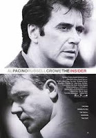
 “THE INSIDER”, a 1999 film by Michael Mann was our example of how a Director can use PULL FOCUS, switching focus from one thing to another, i.e. from background to foreground. There were two reasons why this scene was chosen:
1. For an example for SELCETIVE FOCUS.
2. Visual SET-UP for a character.
THERE IS NO DIALOGUE IN THIS SCENE.
Dante Spinotti, the Cinematographer for the film uses PULL FOCUS to great effect. In a separate room, there is a party and we PULL FOCUS from that, through the glass and FOCUS on the panel of glass to see the reflection of our protagonist. This was a well-constructed scene that was executed with perfection. The scene is about LEAVING and our protagonist feels like an outsider rather than an insider. He is the only one that doesn’t wear white and he doesn’t attend his own leaving party.
We are told this through ACTION and VISUAL PICTURES. To add further paranoia, as our protagonist leaves the building, security watches him carefully as later we discover that he is a whistle-blower and sell secrets about the tobacco industry.
However, DIGITAL CAMERAS are extremely limited when using SELECTIVE FOCUS as it’s the LENS which creates this effect. The SHALLOW DEPTH OF FIELD is what is in FOCUS and everything else around and beyond this area will appear BLURRY.
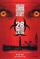
 “28 DAYS LATER”, a 2002 film by Danny Boyle was our example of how creative you can be with DIGITAL CAMERAS and with a LOW BUDGET. The first SHOT after the main credit is of an eye that looks around. Then we have our ESTABLISHING SHOT of our protagonist lying on the hospital bed naked. To create the illusion of SELCTIVE FOCUS, scenes were shot through doors, through fabric, layering the shot to create a FOREGROUND.
 It’s also down to the writing that aids these shots, the door is locked from the outside and the key has been pushed through, every single receiver hangs, everyone in an instant has left. Many of the SHOTS are at a DUTCH ANGLE which create wonderful diagonal lines and that this world is filmed 3-DIMENSIONAL rather than looking 2-D. 3-DIMENSIONAL SHOTS help aid the eye and to create level of IMPORTANCE with the most important objects in the SHOT at the FOREGROUND, as well as looking BIGGER and the least important objects in the SHOT at the BACKGROUND, as well as looking SMALLER and inferior.
COMPOSITION
COMPOSITION is really important as our SHOT has to be FRAMED appropriately as too much space draws the eye of the viewer which leads to EXPECTATION.
HEAD ROOM is how in particular CLOSE-UPS are FRAMED. Ideally, you would want the SHOT to be CENTRALISED, as the closer we reach the end of FRAME; we are reaching the BOUNDARY of the story. However, this is not the case in all GENRES, for example, HORROR. Our HEAD ROOM in one particular SHOT might be off centre to create ANTICAPTION. Or, the head of the object is not the main FOCUS of the SCENE, it might be their body, i.e. in a war film they have been shot or stabbed; or it’s the BACKGROUND, so a sunset for example.
 THE RULE OF THREE is a rule that originates from painting, especially from the RENAISSANCE period. To use this rule, the SHOT would be divided into three’s and our MAIN FOCUS in the FRAME would be the FOUR CENTRE POINTS where our lines would cross.
 LEAD ROOM and NOSE ROOM however shows our object SHOT to the left of screen (LEAD) or to the right of the screen (NOSE). These can be used to show the audience what our character is heading towards, (LEAD – the future) or what is being left behind (NOSE – the past). Ideally, LEAD ROOM will be used as it can DRIVE the story forward however, if we were to use the HORROR genre again, the NOSE ROOM might be used so the AUDIENCE doesn’t see what we are heading towards.
SCREENWRITING
Using two examples of our lecturer’s students, we went through the BASIC STRUCTURE and FORM of a SCREENPLAY. A SCREENPLAY is the BLUEPRINT of the film and has a specific LOOK.
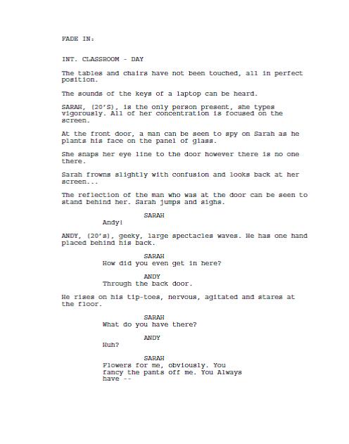
First of all, the FONT that is used is Courier New at size 12. This font is used as it’s the font which closely matches the old-style of typewriters in which they would have been written on.
Then, we write our SLUGLINE:
INT. CLASSROOM – DAY
The purpose of the SLUGLINE informs the DIRECTOR or PRODUCER three crucial aspects of the SCENE.
1. Is it INTERIOR or EXTERIOR? – NOTE: The CAMERA POSITION.
2. LOCATION – Where are we?
3. TIME – DAY/NIGHT.
Our ACTION LINES are SMALL BLOCKS of writing that DESCRIBE what happens:
AMANDA, (20’s) sits at the coffee table.
The very first time we INTROUDCE a CHARACTER, their name is in CAPITALS and is the only time it is. We do this as it helps the PRODUCER to quickly determine how many CHARACTERS there are.
For DIALOGUE, we firstly CENTRALISE their name in CAPITALS and write their DIALOGUE in the specific margins provided.
There are many SCREENWRITING SOFTWARES that can be used, CELTX which is for FREE or FINAL DRAFT which is a bit pricy however that is what the INDUSTRY use. So you might want to learn how to use FINAL DRAFT quickly.
BRIEF
We have been given a very constraint BRIEF which limits us to:
1. 2 CHARACTERS – a MAN and a WOMAN 20’s-30s.
2. In ONE ROOM
3. During the DAY.
4. 1 ½ pages MAX.
Below is my script for the course entitled OBSESSION.


No comments:
Post a Comment